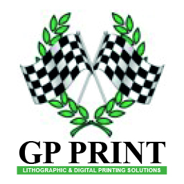
Original GP Print Logo
Our logo started in 1999 when GP Print first started trading. With the abbreviation Greater Peterborough we noticed that GP had a recognisable affiliation with Grand Prix which we liked the idea of matching our fast turnaround services.
With that in mind we branded using a chequered flag and racing green colouring choosing a simple type that accompanied the logo without being too fancy.
Years later we decided that the logo was too big and full to use in marketing in the current climate and didn't match how we had developed to keep up with the times in our products and invested in new machinery. We decided to simplify the logo without losing too much of the identity. We kept the green and reduced the chequered flag into a very simple icon that could still be recognised as previously and accompanied with a new font style that matched the current market trend of using simple modern fonts.

The second logo for GP Print
This brand continued again for many years until we felt again that the market had changed as had our services.
The next logo we again decided to adapt the chequered flag this time into steps to demonstrate how we helped our customers climb up to be seen above all others and how our services offered were of equal stance.
This created a much simpler identifiable logo that we decided needed a font that was bolder than its predecessor and wanted it to be a font that was bespoke as our services had developed into. We wanted to ensure that our services were not seen to be off the shelf and offering something you couldn't just buy off the internet. This logo matched everything we were about and progressed with us for many years before we decided to rebrand with a fresh new look that we were proud of and could shout from the rooftop during a time that very little was able to be shouted about in a positive manner.

The Third Logo for GP Print
Our new logo needed to have the wow factor and really progress the branding to show how we were ready to be noticed above all others. We broke up the steps and scattered them above our name to insure we didn't lose any identification we had previously gained. We decided to escape the previous brand colouring and opt with a number of colours that were identified within the printing services and add a couple more colours to boost the overall look (we even managed to sneak in our old colour albeit very subtle). To emphasise these colours we chose a nice gradient of blues that helped the colours to pop and gave a fresh new look to the way we could identify our clothing and accessories including our shop front.

Our current logo
Our logo is something we are so proud of and really represents us as a business that keeps up with the times and is always looking for ways to develop. We love showing off our new brand so much that we have developed every element including social media, websites and promotional material. We want to make sure you see us and recognise us. We are not going to hide amongst the others as we are proud of our business and want to share our services and abilities with all.