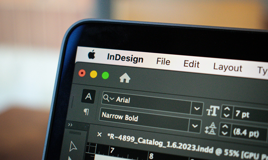
Professional Design Software - Adobe InDesign
You've got your design; you're now ready to print it and let the whole world gaze in awe, but wait! You will need to consider several factors when printing your first design. From what you want to print on, to the colour format, to the issue of bleeding (Don't worry, we have a blog on that!), you will need to do some planning ahead of time. Not to worry, here is a handy guide you can use as a checklist for what to consider when printing a design.
The first thing that needs to be considered is the intended destination of the design. Is it for an advertisement, a catalogue display, a layout for a magazine, a textile print, a poster, etc.? All these different forms of print will affect the approach you take.
The eagle-eyed would have noticed I spelt proof-read wrong. Minor oversights, such as typos and grammatical errors, can be the difference between closing a sale and a customer choosing the competition. Most people consider typos and grammar mistakes a deciding factor in whether to continue reading… or not.
When working on the web, the resolution isn't such an issue. However, when it comes to printing, I cannot stress enough the importance of having high-resolution files. If you don't, your prints will come out blurry, muddy or incoherent. The most important measure you need to worry about for print output is DPI: dots per inch. As the name suggests, this determines the number of dots your printer will create on one square inch of your printed page. You will want your files to be a minimum of 300DPI.
Also note that DPI should not be confused with PPI (pixels per inch), which is concerned with the density of dots in a square inch of screen space and is thus used for digital design rather than print design.
When printing your design files, what you see on the screen often differs from what you get from the printer. Computer screens and digital cameras view colour and light in different spectrums than printers do, and failing to sync the two will reflect horribly in your print. Electronics that produce visible light or interpret it via a sensor use the RGB spectrum to make colours. Most (if not all) design software programs use the RGB colour mode by default. Printers, however, use CMYK. If your computer and printer aren't speaking the same colour language, your results aren't going to come out right. So set your program to CMYK.
The printed item's size will be an essential factor to consider before starting the design process. Reworking the image or wasting a print run could be a costly mistake.
When making the design, you want to account for the bleed area. This is an area around the document's dimensions where the design extends. It is recommended to leave a 5mm bleed.
The bleed helps to account for slight misalignments in printing or inaccuracies in trimming down the prints. Take into account that if there is a bleed area, the design must be printed on a larger sheet so as to avoid getting cut off. From there, trim it down to the required size. This may take longer and may not be cost-effective, but it is the price you pay to make a stronger print design, as there will be no white borders.
Different types of paper create a different feel and visual appeal than others. For example, you can often get the same type of professional results you want with a less expensive semi-gloss paper rather than a heavier matte. Spend a little time considering which type of effect you want to create before printing.
This little guide will help you in preventing costly mistakes and streamline your printing process. If you have any questions, please do not hesitate to contact our friendly GP Print team; we would be happy to help!